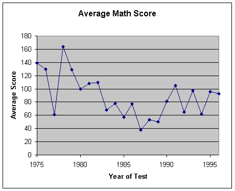
| Assignment1 Run Chart |
| Portfolio | Interest | Assignment1 | Assignment2 | Lab 4 | Feedback |
RUN CHARTS/TIME
PLOT/TREND CHART
In the current competitive world, most companies focus on Total Quality Management (TQM). A run chart can be used in the implementation of total quality management in the company, to assess your business’s quality health.
What is a Run chart?
A Run chart is a simple
graphic representation that displays data in the order that they occur and shows
a characteristic of a process over time. It
is often known as a line chart or a line graph outside the quality management
field.
What is Run chart used for?
Run chart is used to
understand the trends and shifts in a process or variation over time, or to
identify decline or improvement in a process over time. In a run chart, events,
shown on the y-axis, are graphed against a time period on the x-axis. By looking
at the data trends and patterns, there is a potential for improvement in the
process.
History of Run chart
Run charts originated
from control charts, it is initially designed by Walter Shewhart. Shewhart
developed a system for bringing processes into statistical control by developing
ideas, which would allow for a system to be controlled using control charts. Run
charts evolved from the development of these control charts, but run charts
focus more on time patterns while a control chart focuses more on acceptable
limits of the process.
Steps to construct a Run chart
Decide what to
measure, the variable unit and making sure it is taken over a period of time
Gathering data in a chronological or sequential order. For best results, at least 25 or more samples must be taken in order to get an accurate run chart.
Organizing data into
values x and y. The values for x represent time and the values for y
represent the measurements you want to measure.
Create the graph using appropriate scale to make the points on the x and y-axis. Then plot the data points on the chart in the order in which they became available and connect the points with lines between them.
Interpret the data and draw any conclusions as to what action to take. The key is to look for trends in the outcome, and not focus on individual plot points
How to tell whether shift, trend, or pattern occurs
If you have at least 25 or more data points in the analysis, you can use run chart to detect special causes, which is something beyond the usual variability of the process that acts on the process.
|
Year |
Average
Math Score |
|
1975 |
139 |
|
1976 |
130 |
|
1977 |
61 |
|
1978 |
164 |
|
1979 |
129 |
|
1980 |
100 |
|
1981 |
108 |
|
1982 |
110 |
|
1983 |
68 |
|
1984 |
78 |
|
1985 |
57 |
|
1986 |
77 |
|
1987 |
38 |
|
1988 |
53 |
|
1989 |
50 |
|
1990 |
81 |
|
1991 |
105 |
|
1992 |
65 |
|
1993 |
97 |
|
1994 |
62 |
|
1995 |
96 |
|
1996 |
93 |
Common misinterpretation of Run chart
To avoid mistakes during interpretation of the Run Chart, we should look at data for a long enough period of time, so that a "usual" range of variation is evident. It is also important to keep a record of external factors and events that may influence the outcomes. To determinate the pattern and the data’s range of variation are also necessary.
Conclusion
Run chart is one of the simple tools to use to get a quick understanding of a process behavior. If interpreted correctly, you can use it to see what part of the process needs to be improved, or whether the improvement that we have been put into place is effective.
Suggested Software
To create Run chart, you
can use the popular commercial spreadsheet software such as Microsoft Excel,
Lotus 1-2-3, or Borland Quattro.
Recommended links