
The rotateX() method rotates an element around its X-axis at a given degree. This is the syntax:
transform: rotateX(55deg);
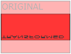
| HTML file: | Displayed by browser: |
|---|---|
|
<style>
div { width: 300px; height: 100px; background-color: yellow; border: 1px solid black; } div#myDiv55 { -webkit-transform: rotateX(55deg); /* Safari */ transform: rotateX(55deg); } div#myDiv120 { -webkit-transform: rotateX(120deg); /* Safari */ transform: rotateX(120deg); } div#myDiv180 { -webkit-transform: rotateX(180deg); /* Safari */ transform: rotateX(180deg); } </style> <body> <div> This a normal div element. </div> <div id="myDiv55"> <b>RotateX(55deg):</b> This div element is rotated 55 degrees around the X-axis. </div> <div id="myDiv120"> <b>RotateX(120deg):</b> This div element is rotated 120 degrees around the X-axis. </div> <div id="myDiv180"> <b>RotateX(180deg):</b> This div element is rotated 180 degrees around the X-axis. </div> </body> |
This a normal div element.
RotateX(55deg):
This div element is rotated 55 degrees around the X-axis.
RotateX(120deg):
This div element is rotated 120 degrees around the X-axis.
RotateX(180deg):
This div element is rotated 180 degrees around the X-axis.
|
Note: Internet Explorer 9 (and earlier versions) does not support the rotateX() method.

