
The justify-content property horizontally aligns the flexible container's items when the items do not use all available space on the main-axis. The possible values are as follows:
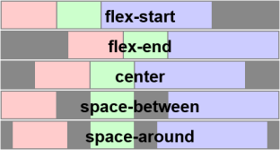
flex-start - Default value. Items are positioned at the beginning of the container
flex-end - Items are positioned at the end of the container
center - Items are positioned at the center of the container
space-between - Items are positioned with space between the lines
space-around - Items are positioned with space before, between, and after the lines
The following demonstrates how to write the code for the flex-end value:
| HTML file: | Displayed by browser: |
|---|---|
|
<style>
.flex-container { display: -webkit-flex; display: flex; -webkit-justify-content: flex-end; justify-content: flex-end; width: 400px; height: 250px; background-color: lightgrey; } .flex-item { background-color: cornflowerblue; width: 100px; height: 100px; margin: 10px; } </style> <body> <div class="flex-container"> <div class="flex-item">flex item 1</div> <div class="flex-item">flex item 2</div> <div class="flex-item">flex item 3</div> </div> <p>All the flex-items are lined up at the right, but in the right order.</p> </body> |
flex item 1
flex item 2
flex item 3
All the flex-items are lined up at the right, but in the right order. |
When we used flex-direction: row-reverse; property, Item 1 was at the right. Here, it is at the left, but all the flex-items are lined up at the right.

