
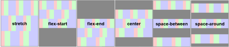
The align-content property modifies the behavior of the flex-wrap property. It is similar to align-items, but instead of aligning flex items, it aligns a flex container's lines within the container, when there is extra space in the cross axis. This is similar to how justify-content aligns individual items within the main-axis. The align-content property accepts 6 different values:
| HTML file: | Displayed by browser: |
|---|---|
|
<style>
.flex-container { padding: 0; margin: 0; list-style: none; float: left; width: 150px; height: 300px; padding: 10px; border: 1px solid silver; margin-top: 10px; -ms-box-orient: horizontal; display: -webkit-box; display: -moz-box; display: -ms-flexbox; display: -moz-flex; display: -webkit-flex; display: flex; -webkit-flex-flow: row wrap; flex-flow: row wrap; } .flex-item { padding: 5px; width: 50px; height: 50px; line-height: 50px; color: white; font-weight: bold; font-size: 2em; text-align: center; } .stretch { -webkit-align-content: stretch; align-content: stretch; } .flex-start { -webkit-align-content: flex-start; align-content: flex-start; } .flex-end { -webkit-align-content: flex-end; align-content: flex-end; } .center { -webkit-align-content: center; align-content: center; } .space-between { -webkit-align-content: space-between; align-content: space-between; } .space-around { -webkit-align-content: space-around; align-content: space-around; } .stretch li { background: chocolate; } .flex-start li { background: tomato; } .flex-end li { background: gold; } .center li { background: deepskyblue; } .space-between li { background: green; } .space-around li { background: hotpink; } </style> <body> <ul class="flex-container stretch"> <li class="flex-item">1</li> <li class="flex-item">2</li> <li class="flex-item">3</li> <li class="flex-item">4</li> <li class="flex-item">5</li> <li class="flex-item">6</li> </ul> <ul class="flex-container flex-start"> <li class="flex-item">1</li> <li class="flex-item">2</li> <li class="flex-item">3</li> <li class="flex-item">4</li> <li class="flex-item">5</li> <li class="flex-item">6</li> </ul> <ul class="flex-container flex-end"> <li class="flex-item">1</li> <li class="flex-item">2</li> <li class="flex-item">3</li> <li class="flex-item">4</li> <li class="flex-item">5</li> <li class="flex-item">6</li> </ul> <ul class="flex-container center"> <li class="flex-item">1</li> <li class="flex-item">2</li> <li class="flex-item">3</li> <li class="flex-item">4</li> <li class="flex-item">5</li> <li class="flex-item">6</li> </ul> <ul class="flex-container space-between"> <li class="flex-item">1</li> <li class="flex-item">2</li> <li class="flex-item">3</li> <li class="flex-item">4</li> <li class="flex-item">5</li> <li class="flex-item">6</li> </ul> <ul class="flex-container space-around"> <li class="flex-item">1</li> <li class="flex-item">2</li> <li class="flex-item">3</li> <li class="flex-item">4</li> <li class="flex-item">5</li> <li class="flex-item">6</li> </ul> </body> |
|
Note: This property has no effect when the flexbox has only a single line.

