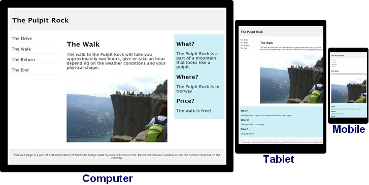
When you resize this window narrower than the picture's width, a horizontal scrollbar appears at the bottom of the window, while the right side of the image disappears. To see it, you must use the scrollbar at the bottom. Yes, the text does does move around to accomodate the size of browser window, that's responsive design. However, the image does not.
Therefore, this is not a 100% Responsive Web Design.
If it was, the picture would have resized proportionately as well, always showing you the picture in full, no scrollbars.
This is all new to me! I've never noticed that before, but certainly will be on the lookout for it now!


