
Fast forward to 1997 or so, and we find a group of Linux/Unix users getting annoyed over the fact that every GUI program they had worked totally different. These people formed groups, who attempted to bring order to chaos by defining a common framework for programs running on the X windowing system. The two most known efforts are Gnome and KDE.
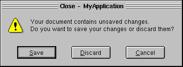
The problems described in this document arised when the Gnome team released version 2.0. One of the features that annoyed people was the change to the Mac style order of cancel/ok. Here is an example taken from Gnome's human interface guidelines.
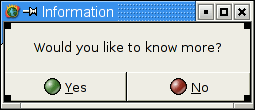
Here's how KDE's UI guide recommends to do the same thing.
Notice how the command button lies in a different place. The headaches arise from the fact that a lot of X users mix programs from Gnome and KDE. An example is the great GTK-based Gimp, which is used by lots of KDE people. This mixing leads to the extremely frustrating dilemma that you cannot predict how a given dialog window will work, because it varies from program to program. This violates grossly the ten usability heuristics of Nielsen.
| Gnome button order | Apple uses it |
| KDE button order | The de-facto standard in computing world (i.e. Windows uses it) |
These reasons can even be nicely combined to "what [the person] is used to". All other reasons are pretty much just expalanations thrown in to support one's pre-chosen opinion. Let's examine some of these.
The scientific rationale used by people supporting the Apple/Gnome button order is the following: "People's eyes tend towards the upper-left and lower-right corners. Therefore the action button should be located there." This seems like a reasonable thought process. However, it requires a leap of faith. Even if we assume that the first sentence is true (which it most likely is), the conclusion does not follow directly.
The only large scale research I know of that supports the above argument is made by, you guessed it, Apple. This research was done in-house by Apple personnel (some of it in the early 80s) and has never been publicly reviewed. This means that the methodology and motives of the research are largely unknown. For all we know some manager could have chosen the button order during lunch and then cherry-picked the data to reach the desired conclusion. This kind of thing is not at all uncommon in corporate america (or anywhere, really).
Note that I am not accusing anyone of falsifying data. I'm just pointing out that the above mentioned conclusion has not been proven scientifically, it is just an assumption (or opinion). Verifying or falsifying it would require a massive transparent usability test. This probably won't be happening any time soon due to money constraints.
The unfortunate fact is that over 95% of existing programs do not behave the way Gnome HIG recommends, so most users are not used to the Gnome button order. This inconsistency sticks out like a sore thumb. I'm quite willing to admit that this is the eat sh*t, 100 million flies can't be wrong defense. But there are cases when the popular opinion is, in fact, the right one. Whether this is one of those cases remains to be seen.
A slightly more serious reason not to use the Gnome button order is the fact that it violates one of the Nielsen's usability heuristics mentioned above. The second heuristic says: "Follow real-world conventions, making information appear in a natural and logical order." To see how this is violated, see the following table.
| left/right | right/left |
| up/down | down/up |
| yes/no | no/yes |
| ok/cancel | cancel/ok |
For every row, choose which ordering of the words seems more natural to you. My (very unscientific) estimate is that most people choose the left column every time (or at least most of the time). The yes/no ordering is especially strong. Just listen to people around you. The speech pattern is always the same: "Did you do X? Yes or no?". Yes always becomes before no, so correspondingly in dialogs yes should be to the left of no. If you follow this reasoning, having cancel to the left of ok is inconsistent.
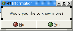
Here is a simple example. Check them yourself and decide which one
seems more natural to you.
I don't expect the Gnome people to change their button order. Most likely this text gets labeled as an uninformed rant of a windows loser. That doesn't bother me at all. What does bother is that all people who use a mixture Gnome/non-Gnome programs suffer. You might try uninstalling Gnome to attain consistency on your desktop. Unfortunately that is not the answer either. In addition to not being able to use a lot of nice programs, the button ordering has started leaking to non-Gnome programs.
The Gnome HIG says you should not have ok/cancel dialogs, but rather ok should be replaced by the command verb. This is actually a good thing, but does not affect the main discussion.
Gnome uses, among other things, the GTK+ toolkit. Its dialogs conform to the HIG, and you can't change the button order without modifying the source. GTK+ is a multiplatform toolkit, and therefore GTK programs look totally out of whack on Windows.
Some extremist people have even labeled the button ordering choice as arrogance on Gnome people's part. The reasoning is that the Gnome way would be feasible if X equaled Gnome, that is, all graphical Unix applications were made with Gnome libraries. Obviously that is not the case, and will most likely never be. This is a big enough reason that Gnome should have adopted a button order that conforms with other X apps. They specifically chose not to do it, and the result is mass annoyment.
Apple's research justifying their button order was done in the early 80s, probably on total computer neophytes. Doing the tests now using test subjects that have at least basic computer skills would most likely yield very different results.
Back to front page.