--March, 1999
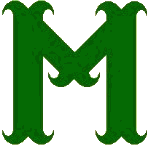 The Greens unveil a new logo this spring, a massive hunter green M, bristling with the barbs of the millstone that is the origin of the Moline name. Designed by cultural liason Dineen Grow and team archivist Shirley Johnson with help from the organization's promotions office, the new logo has a long history, despite its new arrival. Johnson claims that the design borrows openly from the cross Moline, heraldic emblem of antiquity. Still, there's little religious about it, explains Grow. "I see those barbs as fishing hooks, designed to catch our opponents or as those little things that folks used to scatter on the ground to maim the feet of enemies, something like that." The new logo, says Grow, "means war." With two consecutive divisional titles, the Greens are no longer a "soft, lower-case team."
Although she was not part of the design team, team ethicist Suzann Moertl disagrees with that interpretation. According to Moertl, the deeper green of the new logo recalls the Watchtower green Bible of the 1960s, and like that Bible, the green here should remind people of the coming Edenic paradise, where believers will frolic in plotless bliss. Moertl interprets the tines of the letter as symbolic of Jesus Christ, "the complete angler." Moertl quotes Matthew 4:19--"Come after me, and I will make YOU fishers of men."
Naturally, co-designer and team archivist Johnson takes an historical perspective. "The new logo has roots in heraldry," she explains patiently. Its design originates in the ancient cross moline. And that is deliberate. The trend in so many organizations these days, says Johnson, is "marketability," in the choice of both names and logos. Johnson blasts the Sand Gnats, Raptors, JetHawks and she's even harsher on the non-count nicknames like the Storm and the Whirlwind. These teams combine busy logos with weak team names. As for the non-count noun crowd, Johnson wonders, "How does a ball player explain to his daughter that he's a part of the Wind or the Storm? What's that make him, a puff, a breeze? Please. How much sense does that make? Can you imagine how much teasing that girl must face at school?" The Greens haven't changed their name and their new logo has "nothing to do with marketing," Johnson firmly declares. Instead, as fellow designer Grow explains, it's a design that has "everything to do with culture," agrarian culture as the seeding bed to all culture. "What good does grain do us without the miller? And what is the miller without the mill rind? Or the dancer without the dance? Read Yeats and Chaucer and you'll see my point. Consider the role of the modest stirrup. [see Lynn White Jr.'s Medieval Technology and Social Change, 1962.] It's on the shoulders of such modest technological advances that whole civilizations stand." Johnson cites the obvious parallels to John Deere's development of the steel plow, which opened up the American prairie and revolutionized agriculture.
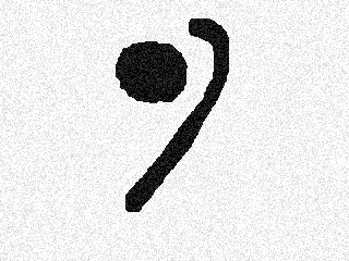
The historical roots of the new team logo are consistent with the development of its predecessor. Although it was dressed up and "made cartoonish" by the Greens' promotions department, the Greens' little g had as father the "g" of the Grangers, ![]() the Moline franchise of the 1930s and 40s. "And it really goes back further than that," explains Johnson. "That little guy comes from the roman uncial g, which comes from other more primitive letter forms." The old Greens logo had as atavistic forefather a symbol (below) that suggests ball game origins (see R. Henderson's Ball, Bat, and Bishop [1947]). The loop of the curve shielded a dot that later became attached to the curve itself. "That dot was a ball," explains Johnson. It doesn't take "too much speculation" to see a bat and ball in that Mesopotamian marker. The religious resonance of Baal and Ball are evident enough, she says, citing F.U. Dout's And G is for God [1963]), which "does nothing but confirm Henderson's thesis." But the sporting connection extends to the very strokes of the ancient letter. "That ancient g is father of lacrosse, jailai, and baseball," concludes Johnson. "In fact, its ties extend to the sickle and sythe, the tools that carved a path to agriculture, domestication of animals, civilization itself. 'The world in a grain of sand, our hopes in a curved blade.'" The new logo likewise honors our agrarian past, even if the millstone comes many centuries later.
the Moline franchise of the 1930s and 40s. "And it really goes back further than that," explains Johnson. "That little guy comes from the roman uncial g, which comes from other more primitive letter forms." The old Greens logo had as atavistic forefather a symbol (below) that suggests ball game origins (see R. Henderson's Ball, Bat, and Bishop [1947]). The loop of the curve shielded a dot that later became attached to the curve itself. "That dot was a ball," explains Johnson. It doesn't take "too much speculation" to see a bat and ball in that Mesopotamian marker. The religious resonance of Baal and Ball are evident enough, she says, citing F.U. Dout's And G is for God [1963]), which "does nothing but confirm Henderson's thesis." But the sporting connection extends to the very strokes of the ancient letter. "That ancient g is father of lacrosse, jailai, and baseball," concludes Johnson. "In fact, its ties extend to the sickle and sythe, the tools that carved a path to agriculture, domestication of animals, civilization itself. 'The world in a grain of sand, our hopes in a curved blade.'" The new logo likewise honors our agrarian past, even if the millstone comes many centuries later.
 HOME
HOME