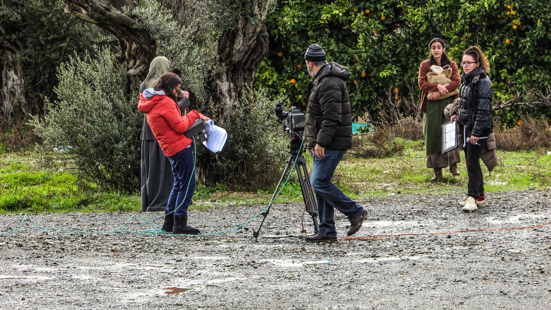
The goal of Northern Lights studios is to showcase the smaller, less-seen side of the film industry. For nearly ten years, Northern Lights has fostered the creativity of young filmmakers from the Pacific Northwest. As Northern Lights stands bright against the shadows of Hollywood, this website serves as a spotlight on the amazing work that they do.
To achieve this, I started by researching how other film studios, big and small, were making a space for themselves online. What were the common trends? What worked? What didn’t? While these factors were certainly taken in to consideration, I also wanted to see how Northern Lights Studios could stand out from the other studios while still commanding their space in the industry. Having worked on the studio’s branding in the past, I had a strong idea of how to translate their independent spirit to the web.
The studio’s name served as the primary source of inspiration for their branding: The Aurora Borealis is nature’s own cinematic masterpiece, and the visual of the vibrant lights against rugged terrain and a dark sky match the adventurous, independent spirit that guides Northern Lights’ filmmaking values.
The color palette draws from the northern lights directly; dark navy serves as the primary color for the site, representing the night sky and providing a sleek, professional backdrop to showcase the studio’s films. While dark-themed websites are common for film studios, the bright accent colors of green, teal, and violet help Northern Lights’ unique personality shine through. Taken from the vibrant hues of the Aurora Borealis, these bright colors dot the site, drawing attention to key items and guiding the viewer’s eyes around each page.
The logo is a simplified version of a print logo I designed for the studio. The simple geometric shapes influenced the overall web design, as well as the typographical choices. Hind serves as the display font – a san-serif typeface with a contemporary feel, particularly when styled all lowercase. Roboto serves as the complementary body typeface, keeping with the modern, san-serif vibe but contrasting Hind with a more condensed look. These fonts work well for Northern Lights’ young and bold creators and audiences, thought they are also practical in terms of web-use and legibility.
The site is based off of a 6-column grid layout, allowing for flexibility and continuity on each page. The pages are also unified by a simple navigation bar (featuring the Northern Lights logo) and a fixed footer that encourages visitors to sign up for the studio’s newsletter and follow them on social media – ensuring that users stay connected with the studio and its ever-growing projects and events (the primary goal of the site).
The site also incorporates three main backgrounds – solid navy, “day-light” (a semi-transparent white gradient over navy), and “night-sky” (a navy overlay over a photograph of the northern lights). The solid navy and day-light backgrounds serve as backgrounds for text-heavy sections (such the Our Story page) while night-sky adds texture and depth to pages with less text (like the Contact Us page).
The Homepage serves as the main hub of the site: introducing the studio, highlighting the other pages, and inviting the visitor to explore the site (as well as sign up for their newsletter!). The page is broken into sections, separated by backgrounds, in order to establish flow and hierarchy.
Our Films is the studio’s portfolio page – highlighting their catalog of films. The thumbnails for each film are displayed in a simple grid-system. Rather than including captions for the images, the titles for the films are revealed when the user hovers their cursor over the thumbnail. This both streamlines the look of the grid and encourages the user to click on the thumbnail, which opens a modal containing the film’s trailer and more information.
The News page is the precursor to what I hope to be a full-fledged blog. While I did not have the time and resources to build a fully-functioning blog complete with RSS feed, I was able to establish a basic blog layout, including text and image formatting. Using the day-light background, the page follows the 6-coumn foundation, using a subtle shadow effect on the blog image to establish hierarchy and focus. The page also contains a Twitter feed and Tweet button, further encouraging the visitor to connect with Northern Lights Studios.
While I am proud of where this site is at the moment, there are some areas I would like to improve upon in the future.
In addition to expanding both the blog and my understanding of RSS feeds, I would like to improve my skills with JavaScript. When I started designing this site, I tried to build it through CSS and HTML alone. However, I quickly realized that a number of elements I wanted to create (like the modals for the film page) required some level of JavaScript. I ended up incorporating Bootstrap into my site, since it was the only way I knew how to incorporate those elements without using a template. Learning JavaScript will be a top priority for me going forward.
I am also interested in exploring the use of animation in web design: I briefly explored elements like scrolling effects and animated northern lights backgrounds, but ran out of time to fully implement them. This would also require a deeper knowledge of JavaScript, since most web animation relies on it.
Finally, I would like to edit the site so that it fully responsive. My focus for this project was to get the site up and running, so I was less concerned about the site’s responsiveness. However, as the digital age progresses, having a mobile friendly site is basically mandatory at this point, and I would like to explore ways to make my current design fully responsive.
That being said, one of my biggest struggles as a web designer is knowing when to stop. I have a hard time declaring a website “finished,” as I constantly think of new elements I want to add or details I want to tweak. For me, my sites are never fully complete, and that may just be a part of web design in general. And so, while there are things I certainly want to improve on for Northern Lights Studios, I am happy to publish this site and declare it complete (for now).
Web and Brand Designer