Scroll Layout and Design
A word about Scrolls in the SCA
Attempting to be exactly and totally period when dealing with the scribal arts is a gesture which 99.5% of the SCAdian populace would find futile. Scrolls in the Society are given out for awards, proofs of companionship in an Order, or the bestowment of arms (AoA, GoA or Patent). The difficulty with this is that the vast majority of the period examples are effectively paperwork. A scribe would quickly scrawl a document allocuting exactly what the grantor was giving to the grantee and for what, slap the Royal seal on it and send it off. The primary exception to this was a grant of arms from the CoA, which was (compared to the liturgial works of the day) mildly illuminated. No fancy script or painstaking illumination. These were practical documents written in legal language and not something that you or I today would frame and proudly display as a work of art.
Lets face it, the average person in the Society will receive two scrolls in their SCAdain "career" and we'd like something that's pretty and noteworthy to impress our friends rather than something that's tossed in the back of the closet. For a much more in-depth and comprehensive treatment on SCA vs. period scrolls, I would entreat the reader to consult the article "There are no Srolls" by her Excellency, Mistress Theresia von Tux (Dr. Catherine Helm-Clark) which appeared in the Fall 2002 edition of Tournaments Illustrated (issue 140).
As such, we take our inspiration for scroll design and illumination primarily from liturgical works in period. Antiphonals, psalters, graduals and Books of Hours. To this end, we will look at the general layout of these documents through period as it applies to the manufacture of scrollwork in the Society.
General Considerations
Looking through any number of period manuscripts, you will quickly realise the very basic format. A border, often ornate and rather thick, surrounding an image (called a miniature) or decorated initial and, frequently, some text. For our purposes, many times the miniature is either diminuated or entirely overlooked. This is for several reasons. Some of us either cannot or do not wish to paint such an involved piece, there needs to be more space for the text or the original is nothing but a bordered miniature.
In any event, when planning scroll design, there are a few considerations to take into account.
Early Days, early ways - Scroll design before 1200
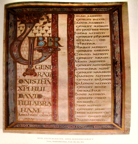
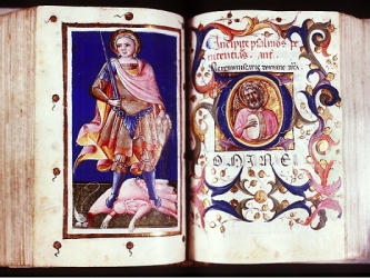
When designing an early period scroll (and I'm defining early period as pre-1200), there are a few things to keep in mind. The first is balance. Early scrolls were normally bi-symmetrically balanced, that is to say, the border is evenly spaced both side to side and top to bottom. Also the left and right borders are even in width. Examples to followas well as the top left picture. They are small on purpose so you can see the overall effect and not distracted by the interior stuff.
The left-most image is in the "Psalter" or "Breviary" style, with two columns. The middle image is what I call the Calendar style, with an arched top border which is common to the calendars. The third image is common to the Irish Gaelic style, with a VERY oversized capital which is deeply illustrated with knotwork.
Calligraphic Scripts : Suggested scripts include Carolingian Miniscule and Unical.
Colours : Red, blue, pink, green, purple, yellow, black, white, gold leaf.
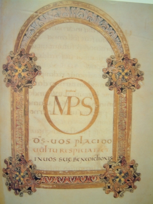
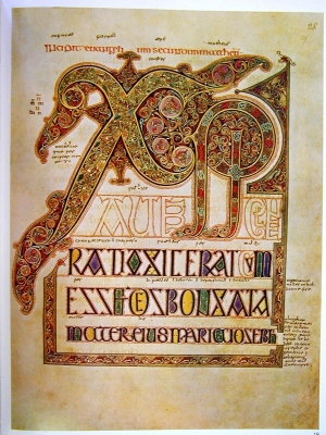
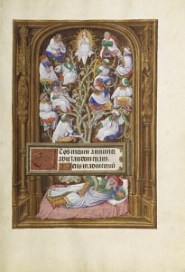
Big Initials, little miniatures : Scroll design in the 13th and 14th Centuries.
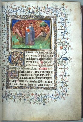
During the 1200's, there was a significant change in design and colour usage. Gone is the fixation with symmetry, full page miniatures and the wide palette of colours. In its place are large initials integrated with the border, offset text and borders that rarely fully enclose the text and a MUCH more restrictive palette. Below are some indicitive examples.
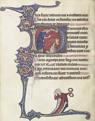
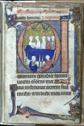
Note the predominance of blue, red, white and gold. Also, there is the introduction of figures in the borders which have little to do with the text involved. They are called grotesques or drolleries, depending on whether their appearance. Also, during the early 1300's, ivy leaves started to spring from the border areas (right image). This style of illumination is early bar and vine, a pattern we will talk about later. The capitals are illuminated and detached from the text (in comparison with the Irish Gael). Instead, the borders are attached to it, many times appearing to be the font of the sprays of gold, blue and red.
Calligraphic Scripts : Almost exclusively a form of Angular Gothic.
Colours : Red, blue, white, gold leaf, shell gold and occasionally pink.
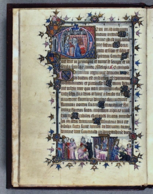
Things start to change in the closing days of the 1300's. Regional styles start to develop, starting in Italy and spreading northward quickly. Increased fluidity in the borders, excessive uses of gold leaf and full page miniatures with "new" and exciting colours appear (example below). This movement signals the dawning of our next chapter.
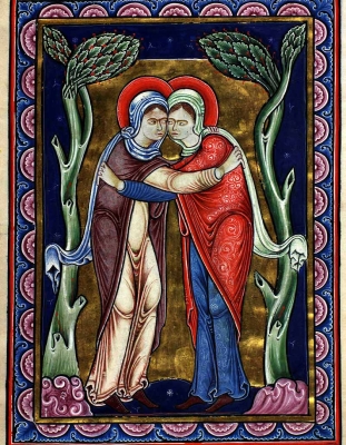
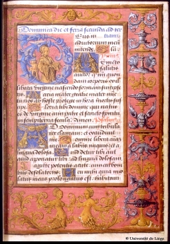
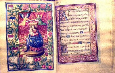
A Century of Hours - Scrollwork in the 1400's.
During the late 1300's, a new style started to develop that would significantly change the face of illumination and it was gold that drove it. Before, with rare exception, illumination was done for the Church, in liturgical documents. During this time, however, wealthy lay-persons started to commission scribes to make richly illuminated books that they could carry with them for daily prayers. These volumes, called Books of Hours, were richly illuminated using a wide palette and a dazzling amount of gold leaf. The comparitively large miniatures returned with a vengance and some of the most beautiful work ever seen are found within these books, some of which are no larger than a pack of cigarettes. There are two principle sub-divisions of this time which we will discuss after covering elements that are the same throughout this period. First is the offset nature of the border, which follows the general pattern of 1:1:2:4 (inside:top:outside:bottom). As often as not, if there is a miniature on the page, the 'text box' is in a cathedral shape. Often, there is a miniature on the left page and the illumination matches on the right page, where the text completes the story of what the image is attempting to convey.
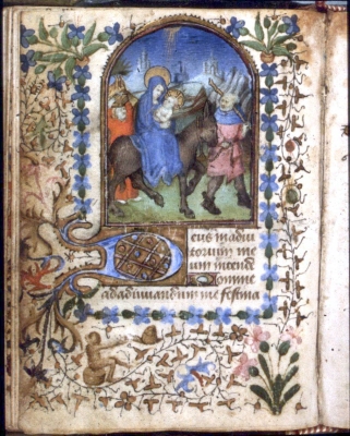
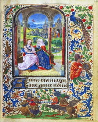
Things to note are the increased palette, the almost excessive use of gold (all of the ivy leaves in first two images are indeed gold) and the two styles that emerge. The earlier style is the "bar and vine", which is an expansion on the 1300's bar and vine we saw earlier with lots more gold and intricacy. The other form is the "international" or "flemish" style, which incorporates acanthus leaves (the swirly blue and gold leaves in the latter two pictures) and more flowers. It's also bolder, brighter and more realistic. Please note that the drolleries in image 2 and 4 are much more realistic than the grotesques of earlier centuries. This becomes an important trend in the light of that new-fangled german invention...the printing press.
Calligraphic Scripts : Angular Gothic, with some Bastarta and (in italy) Gothic Rotunda (AKA Italian Humanist).
Colours : Gold...lots of it. Also, varying shades of blue, red, green, and white.
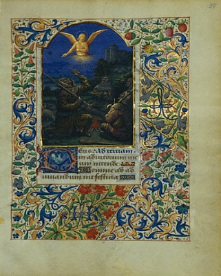
Getting Real: The closing days of Scrollwork
After the introduction of Gutenburg's press, the face of illumination and calligraphy changed dramatically. Gone are the days when every text was hand-copied. Now, items which were illuminated were more novelties and status symbols for the very wealthy. Further, a revived interest in things of nature caused a shift away from the fanciful and artistic to life-like images of flowers, insects and even jewels. In some the borders were made to be out of stone, carved wood or even worked leather with amazing results.
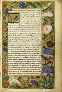
As you can see from the above three images (and the right-hand image at top), many different styles developed.
Calligraphic Scripts : Gothic Italic, with some Bastarta and Gothic Rotunda (AKA Italian Humanist).
Colours : as varied as in nature. No one colour scheme appears to predominate.
In conclusion
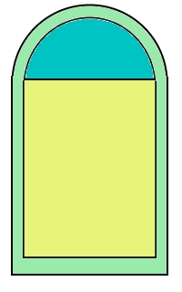
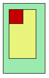
or What now?We have taken a brief tour through the major styles of western european illumination. What is here is to be a basic start. From here, do your own research and find your own style. I will, however, leave you with some basic block diagrams denoting the major styles. Green represents border illumination, yellow text, red a capital and blue a small miniature.
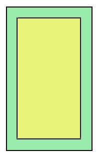
 Early styles.
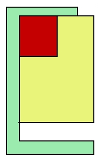
 Middle bar/vine and Book of Hours.
Return to Scroll Storehouse
Return to
Main