


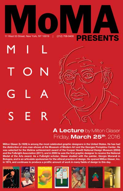
Milton Glaser ~ Moma poster
I thought that a simple design would suit a poster for Milton Glaser, as most of his designs are of a minimalist style where less is more. I used some of his more localized (NY) designs to line the pages of the poster, used his name logo and his self portrait, put the background in red keeping in line with his branding, and kept a clean, simple font to push the artist’s biography and show information. I also got the MoMA logo from the MoMA website.
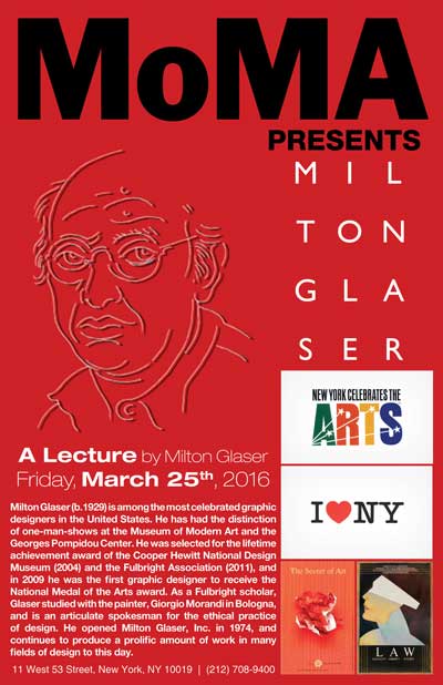
The second poster, newly updated, went a bit off character for Glaser, and submitted what I think that MoMA may have created. I still used Glaser’s name logo, but in black. I had to recreate the “I Heart NY” work to get it large enough to print without pixilation. (I also had to recreate MoMA’s logo for both works as well as the Milton Glaser name logo.) I thought that maybe MoMA would want to show that Milton Glaser is the gold standard of designers, so I created a gold gradient, and for the “I Heart NY” art, I used a white box with a 90 degree gradient feather to overlap the gold gradient giving it an appearance of sitting on the top of the gold.
“There are three responses to a piece of design—yes, no, and WOW! Wow is the one to aim for.” ~ Milton Glaser
The Governors ball music fest
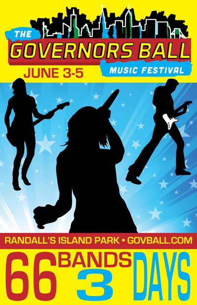
This is an annual event in New York called [sic] “The Governors Ball Music Festival,” and it is a three day event on Randall’s Island, located in the Harlem and East Rivers. This music festival was launched in 2011 and each year the logo is slightly different. The text is similar in the logo, but the background skyline of NYC is different.
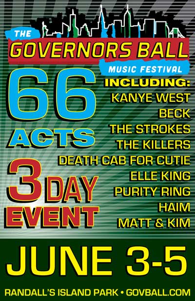
On the first piece, I threw in some clip art of musicians and a starburst background to spice up the layout. At the top is the logo with the event date. I have the location and website, and at the bottom, I put in a teaser about 66 bands in 3 days.
The next poster is a starburst and grid overlaying an offset, circular gradient. I shortened the list of artist. At the top of the poster is the logo, and, if one starts at the logo and continues down from “Music Festival,” the viewer can immediately see the main acts. If the viewer’s brain takes over and starts from the far left again, the viewer will see how many different acts are playing in how many days, and then follow down the list of major players until the viewer then sees the dates, the location, and the website.
"I normally don't like festivals, but this one is great! ~ Jack White
Black Friday 2015 advertisment
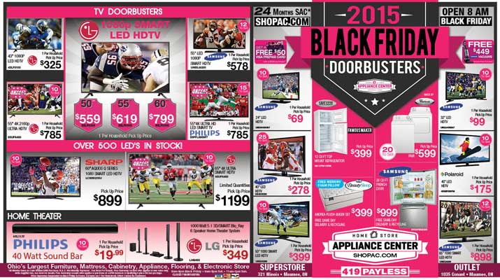
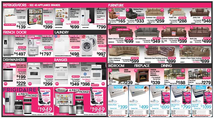
The most recent item of note that I had created was a 2 page spread for a client to run in the local newspaper for Black Friday. It was short notice and took 18 hrs straight, plus a few more the next day just to make sure there were no mistakes made in the later hours of designing. The client wanted to go with pink and black as the staple colors, so I ran with it. I was given a list of product (names and models) along with pricing and a priority of order for showing the items.
This was done in InDesign and has 5 layers, Background, Graphics, Text, Product and Template Layers. There are 180 linked images and graphics and probably too many font styles, but the customer is always right.....right? There were a few tweaks here and there that had to made, but overall, the client was satisfied especially in the short timeframe.
"The man who stops advertising to save money is the man who stops the clock to save time." ~ Unknown
© Copyright 2016. "TDI Design" by IDP Technologies, LLC. All rights reserved.


