|
- Step Two: Choose the table in which the variable you wish to create a graph of is stored from the drop down menu at the top.
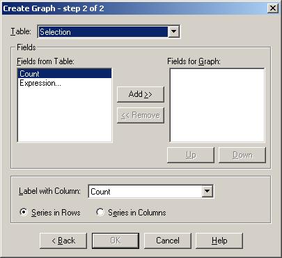
- Select the field(s) from the table you wish to make a graph of. Click the Add>> button to add these fields to the graph. For this example, select all the fields except the total population.
- If you wish to add variables from more than one table, choose the next table from the drop down menu at the top and add fields from it in the same way.
- Choose the field with which you want to label the x-axis of your graph. Choose whether the series is in rows or columns. In our case, the series is in columns. Click OK.
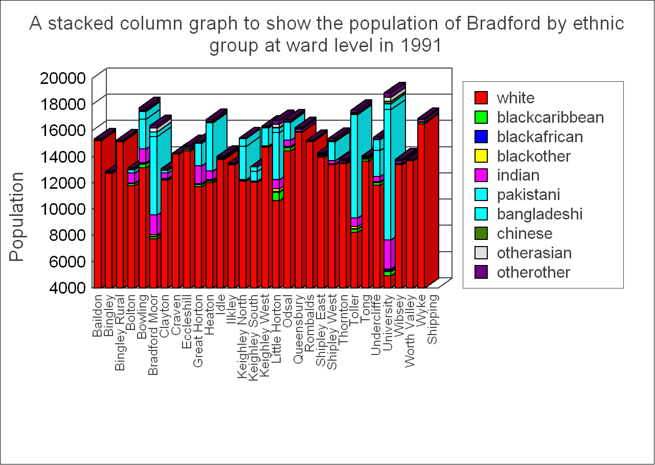
 The axis across the bottom of the graph is the x-axis, which is used to show the independent variable, i.e. the variable against which the dependent variable, which is on the y-axis (up the side of the graph) is measured. In our example the x-axis would show the ward, and the y-axis a count of people in each ethnic group. The axis across the bottom of the graph is the x-axis, which is used to show the independent variable, i.e. the variable against which the dependent variable, which is on the y-axis (up the side of the graph) is measured. In our example the x-axis would show the ward, and the y-axis a count of people in each ethnic group.
|

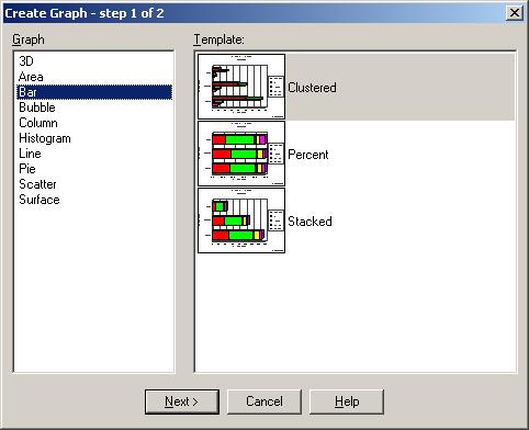
 Data in tables which are not mappable may be used to create graphs.