 |
| FLAGMAN'S "REVISING THE NFL" PAGE! |
| Sometimes you have just got to shake things up a bit just to make things interesting. This not only includes flags, but other public icons as well. In this case, I have gotten bored with alot of NFL team helmets. "Tradition" is the term most often used as the excuse for keeping helmet designs stagnant. I say, to hell with "tradition". Here's some new designs for all to consider. Atlanta finally got rid of the tired falcon logo in use since the early 60's! They now have a decent looking modern logo! Kudos to the Atlanta ownership for being brave enough to make the change. The Cleveland Browns are changing their helmet - NOT! They are making a radical change by going from a plain orange helmet to a plain mettalic ornage helmet! How much visionary thinking did that take? OH! Does the excitment ever end? I can't take any more of this! |
 |
 |
 |
 |
 |
 |
 |
 |
 |
 |
 |
 |
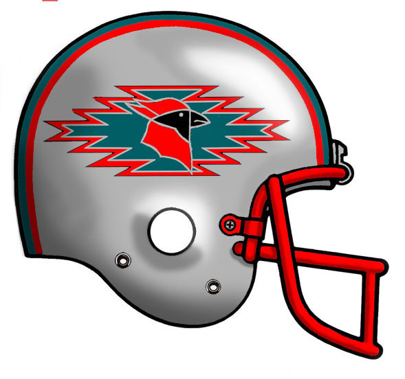
| The Arizona Cardinals helmet is a relic of a bygone era. What I have done here is made it a little more regionally significant. This is more of a Southwest style, Native American influence. The helmet is silver, with a turquiose, silver, and red cloud. The cardinal is also done in Southwest style in red, black, and silver. |
| The Indinapolis Colts needs a major face lift! I have changed the helmet color to blue and added two interlocked white horse shoes to represetent the two cities that the team has played for. |
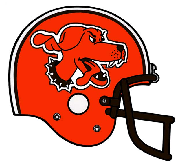
| Who let the Dawgs out? Cleveland is the team in most dire need of a face lift. Here I have kept the helmet mostly orange, but added a an orange "dawg". |
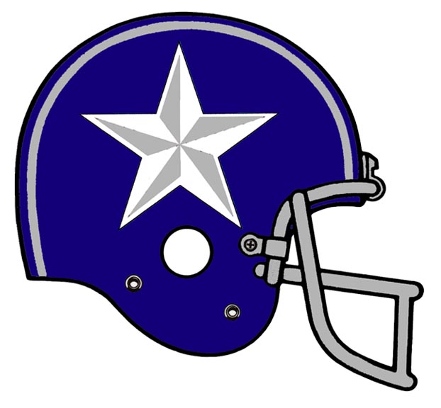
| Who would change the Dallas Cowboys? I, as a die hard Dallas fan would! I kept it some what traditional, but I reversed the colors and made the star a bit more like the classic "Lone Star" of Texas. |
| The Detroit Lions are in such need of change that they are finally changing, but just added a dark outline to the white outline around the lion. People like "classic", so here is my version of what "classic" should be. This is far better than what they have now. |
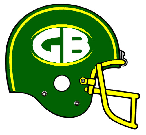
| The current logo of the Green Bay Packers needs to be put in the Smithsonian! I kept it some what traditional but changed the colors around. Now it is a green helmet with a "GB" bursting through the yellow oval. |
| The helmet of the Jacksonville Jaguars is ALMOST good. The mistake they made was putting a logo with a black outline on a black helmet. I remedied the situation by adding a white outline around the logo and placing it on a teal helemt. The result is a much better looking helmet! |
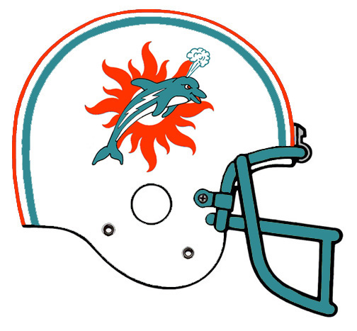
| The Miami Dolphins has a pretty cool logo, but it is now decades old. I made the sun look a little sunnier and the dolphin a little more fun looking and spouting off at the blow hole. This is a vast improvement. |
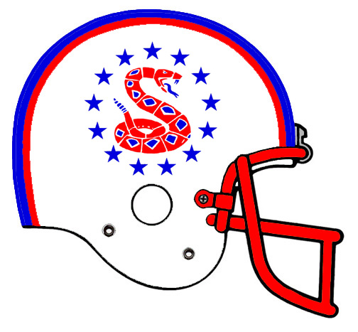
| The New England Patriots are pretty ready for a change. Let's go past the "patriot" motiff and go for something different. I added a rattle snake, which is a colonial emblem from the Revolutionary War, and added 13 stars around it, how much more patriotic can you get? |
| The New Orleans Saints have always had that classic New Orleans feel. In this update I changed the fluer-de-lis to a slightly different rendering and changed the colors to the classic Mardi Gras colors. Can't get any more New Orleans than that! |
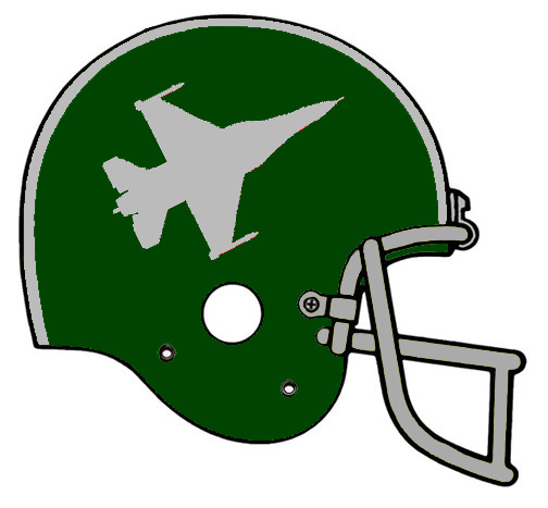
| The New York Jets made a mistake in going to a throw back version of their helmet. Lets move forward, not backwards! Here I took a green helemt and added a silver fighter jet. In this time of fighting al-Quaeda, nothing is more appropriate! |
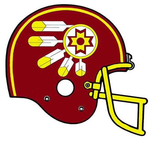
| The Washington Redskins logo dates back to the early 20th century. I decided it was time for a change! I took a more modern approach to classic Native American design and came up with this. |
| HATE MAIL more to come ... |

|
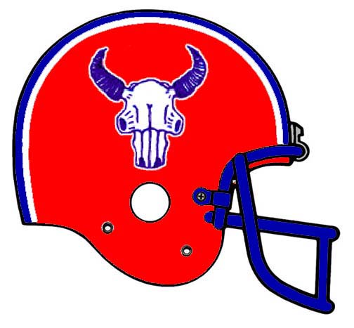 |
| Buffalo is in dire need of change. OK, the buffalo on the helmet has gone through some changes over the years, but it is still your basic buffalo. Here's my idea, a buffalo skull. This definitley looks meaner! |
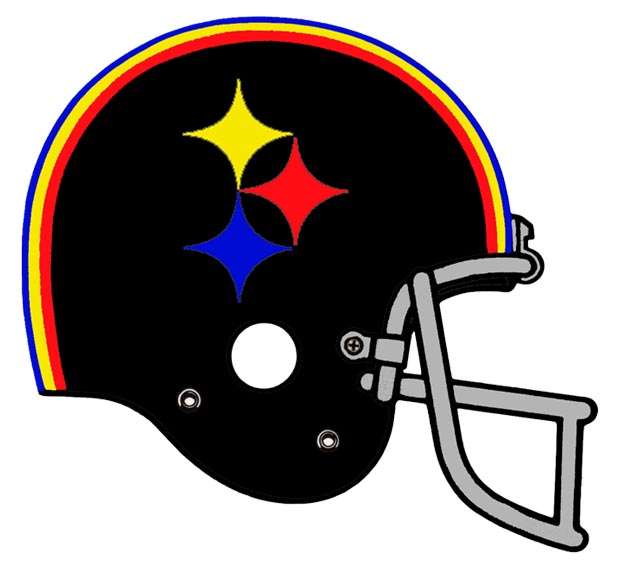 |
| The Pittsburg Steelers are also in need of a face lift. Here I have kept the classic black helmet and added the cycloids from the Steel logo. The stripes have been modified to reflect the color of the cycloids. |
| The Oakland Raiders actually have a pretty good helmet. The bad thing is, it is decades old. Here I kept the idea for a "raider" by using crossed swords and making the helmet black to maintain the "bad" image of the Raiders. |
| The Minnesota Vikings are long over due for a logo overhaul! I took the mythical horn and replaced it with something a little more historically acurate. This winged helmet is actually closer to what a real Viking would have worn in the days of old. The sword is an added touch. |
 |
 |
| Click the image to see the larger size. |
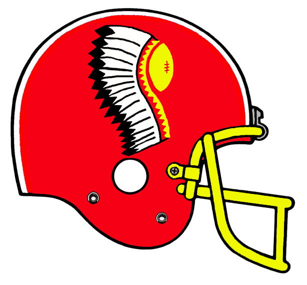 |
| Kansas City is ready for a change. The logo is approaching four decades old! c'mon now! Isn't someone somewhere ready to see something new and different? Here I took the classic red helmet and placed a football adornded with a Native American war bonnet. Personally, I like it. |
| Click here to see my full sized goalie mask. Need a helmet for your own fantasy team? Click here |