Branding Suite
Logo
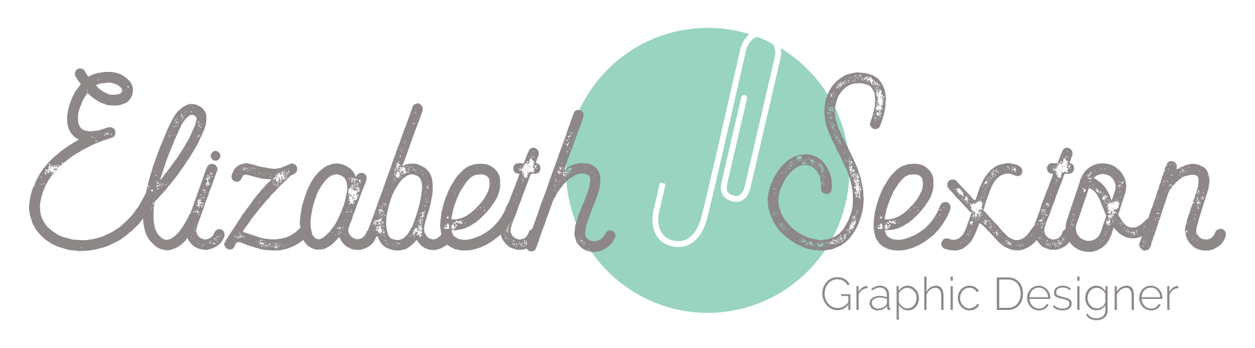
To best represent myself and my style, I wanted the logo that I created to reflect my personality through the use of strong, feminine characteristics that also represented my abilities as a graphic designer. I accomplished this using a handwritten script font that provides a feminine feel as well as illustrates my appreciation of individuality. The weathered nature of the font shows my strength. The font has withstood hardship, and yet is still standing. The color used for the circle element is feminine in its pastel color. The use of negative space in designing the paperclip captures the creativity that I possess.
Digital Resume
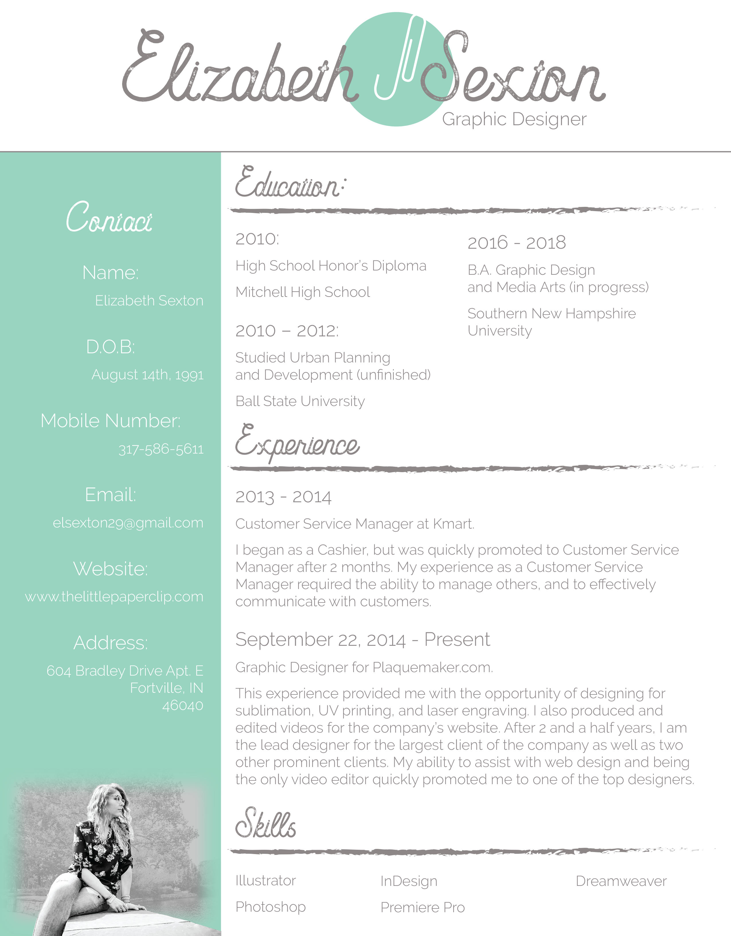
In designing my digital resume, my largest goal was to showcase my experience and my skills in graphic design. I also wanted to remain consistent with the brand that I had begun to create. This is all accomplished through the creation of my digital resume. I utilized the fonts that I decided upon in the logo and carried over the color scheme that I had developed. I also used the negative space element that I had developed in the logo in creating a side bar that housed my contact information and an image of myself.
Business Card
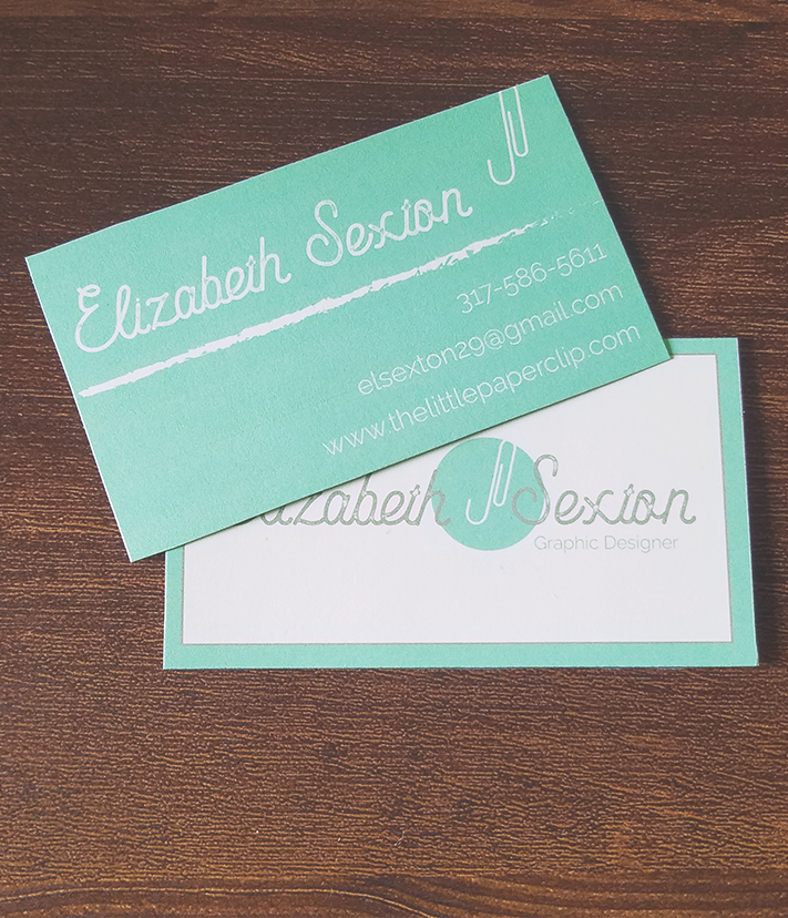
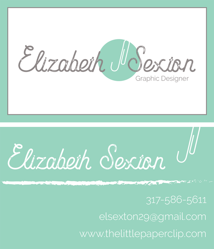
The business cards that I created derived the elements from a combination of the logo and the digital resume. I used the logo as a basis for the creation, but continued with some elements, such as the separating lines, that I had established in the digital resume. For the back of the business cards, I continued to use the negative image of a paperclip but allowed the circle it was housed in to take over the whole area. This allowed me to persist in using the white text that was also present in the side bar of the digital resume.
Letterhead
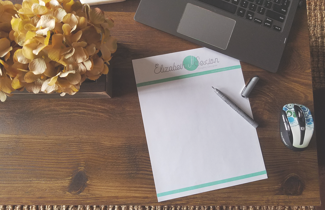
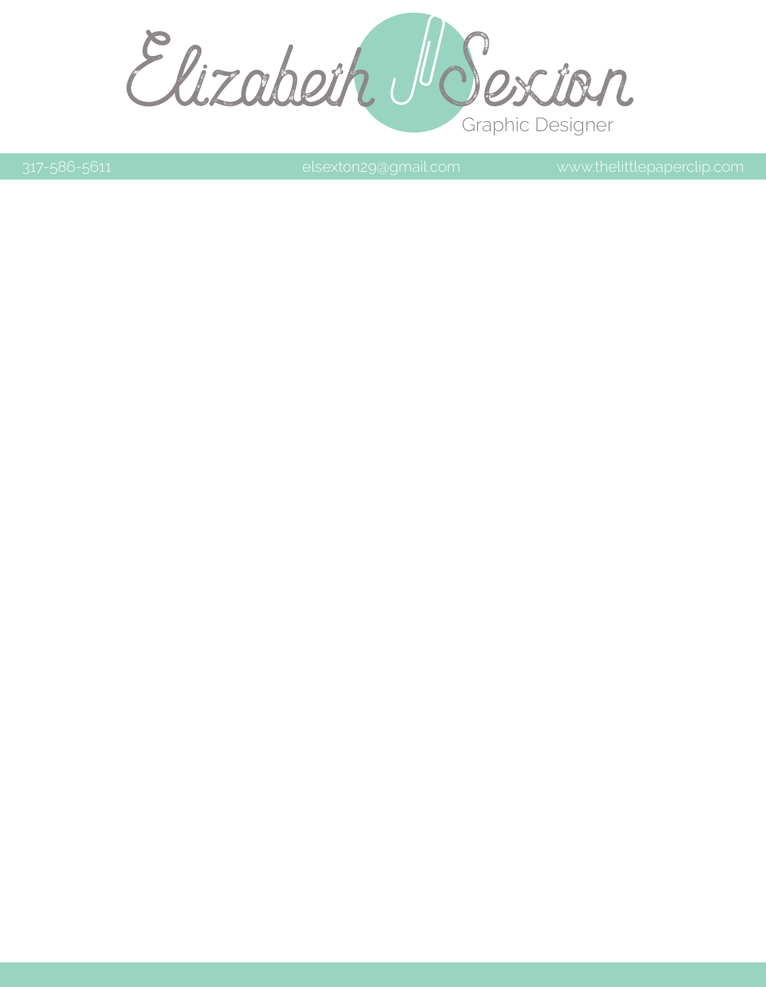
The purpose of the letterhead was to create a stationary item that was consistent with the brand that I developed and could be written on and given to others to further promote myself. I used the logo that I had previously established and broke up the areas of the page using bars of the same color as the circle behind the paperclip in the logo. One bar separated the logo from the writing area and another bar spanned across the bottom to frame the writing area. The upper bar also contained my contact information in the same white font that I had used in both the business cards and the logo.
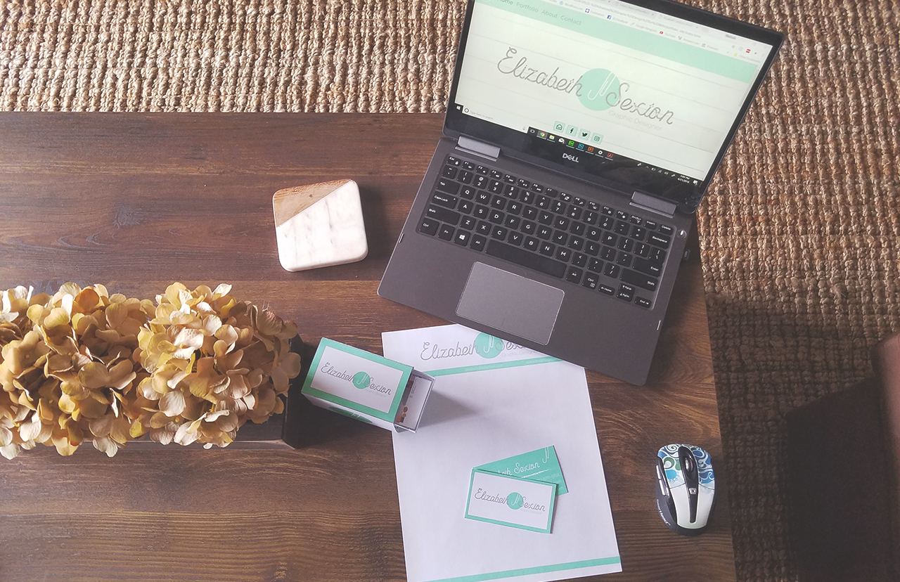
Leave-Behind Piece
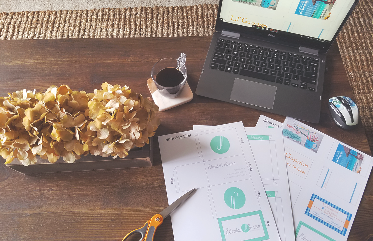
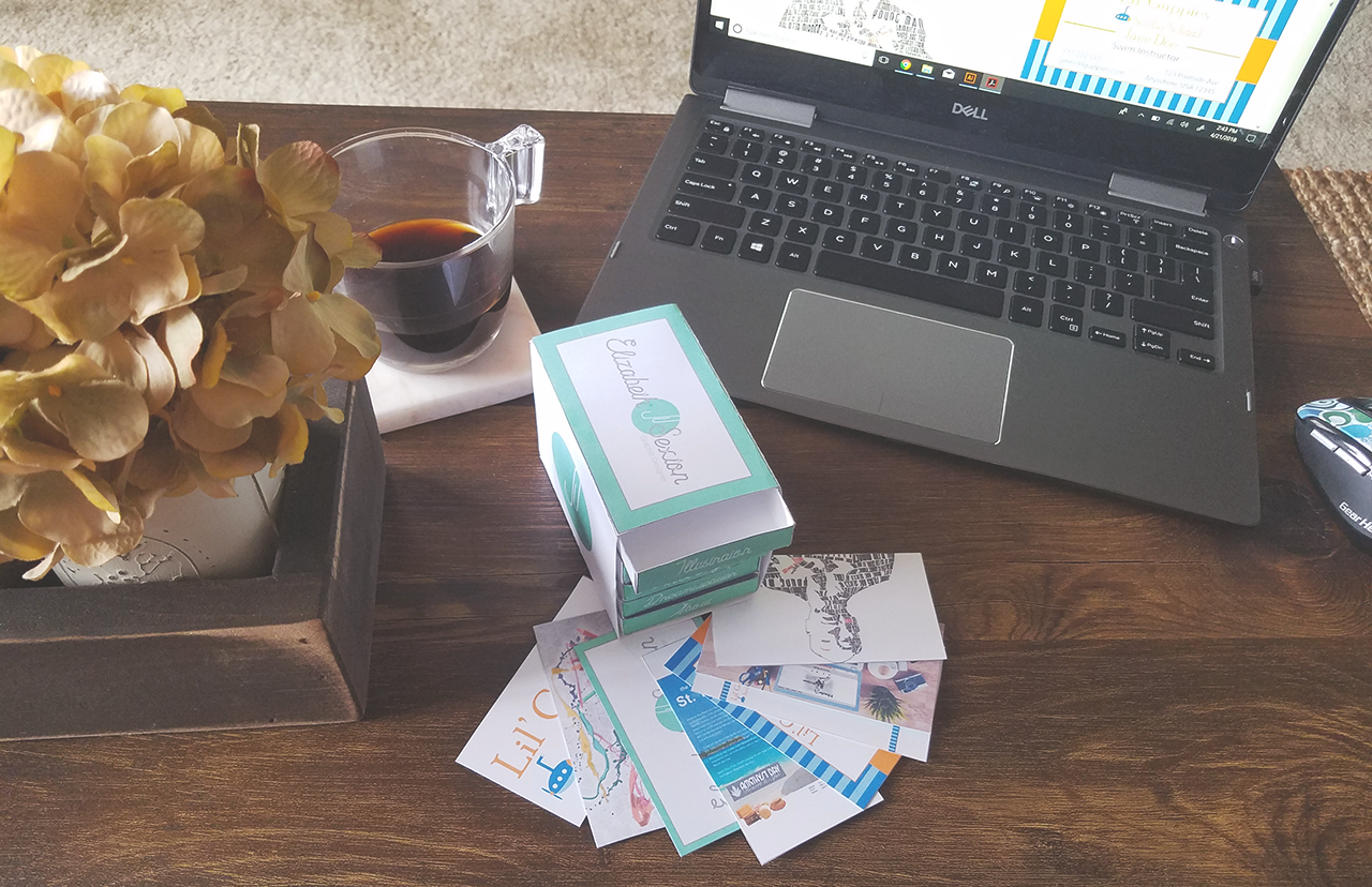
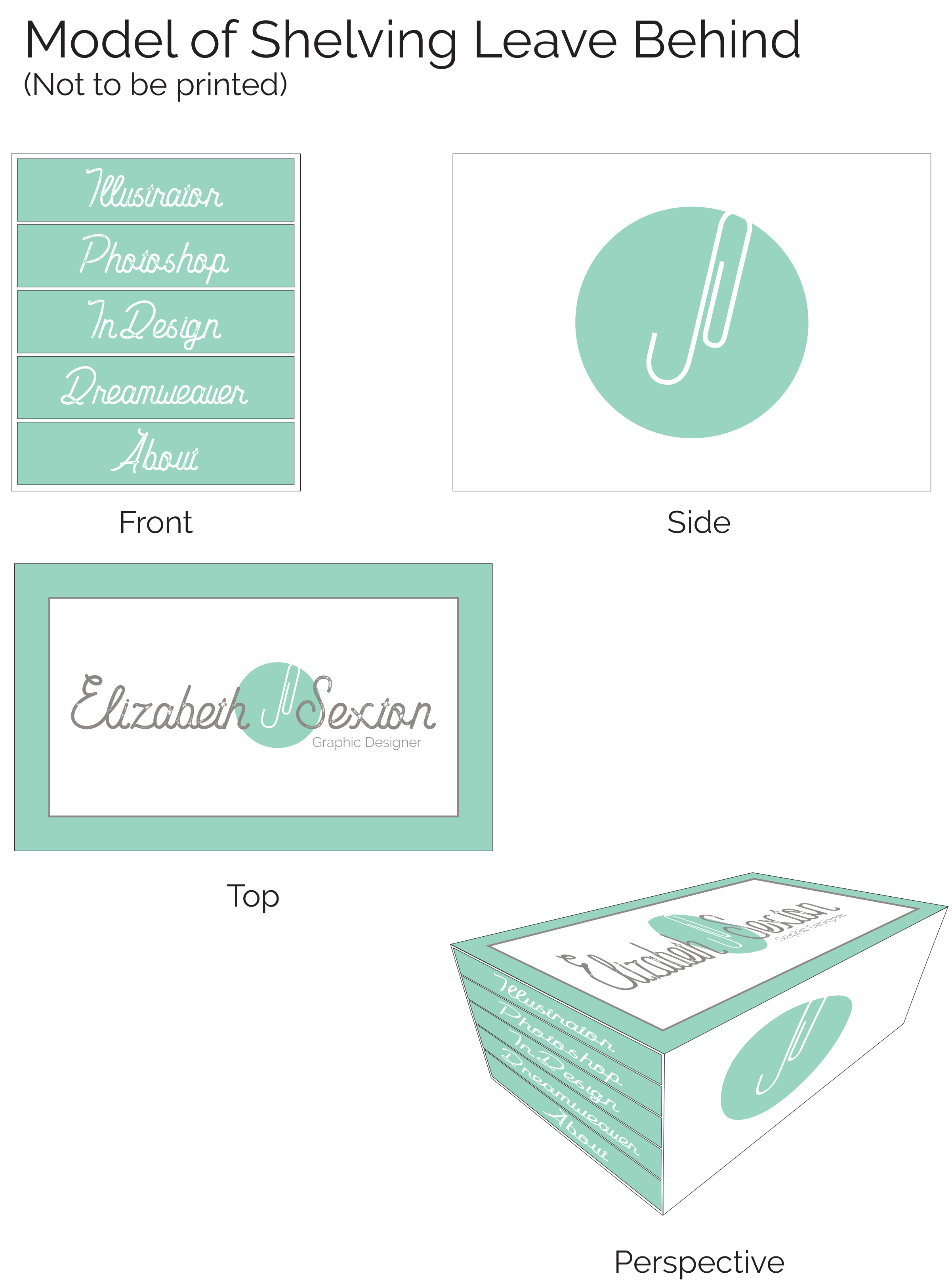
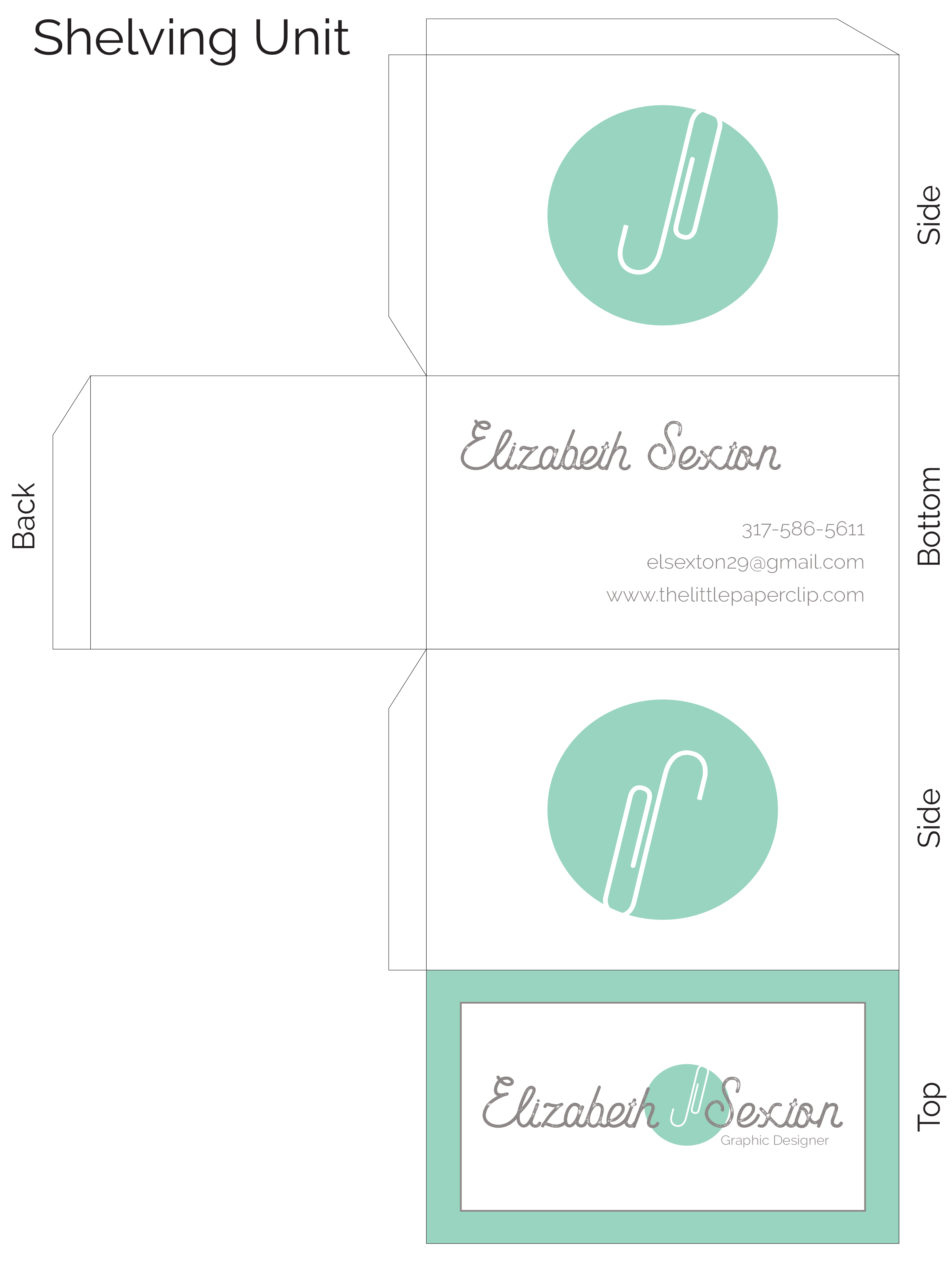
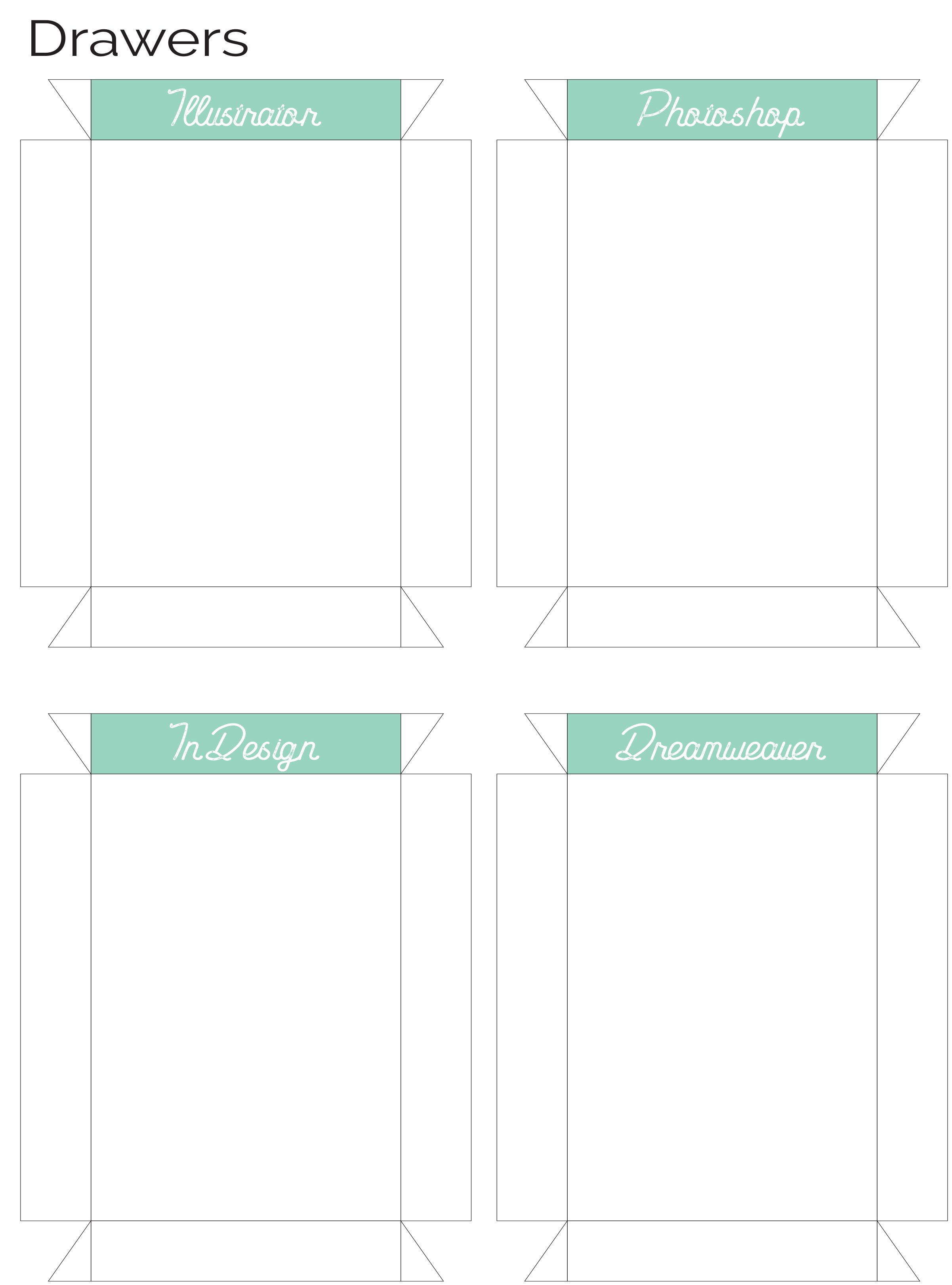
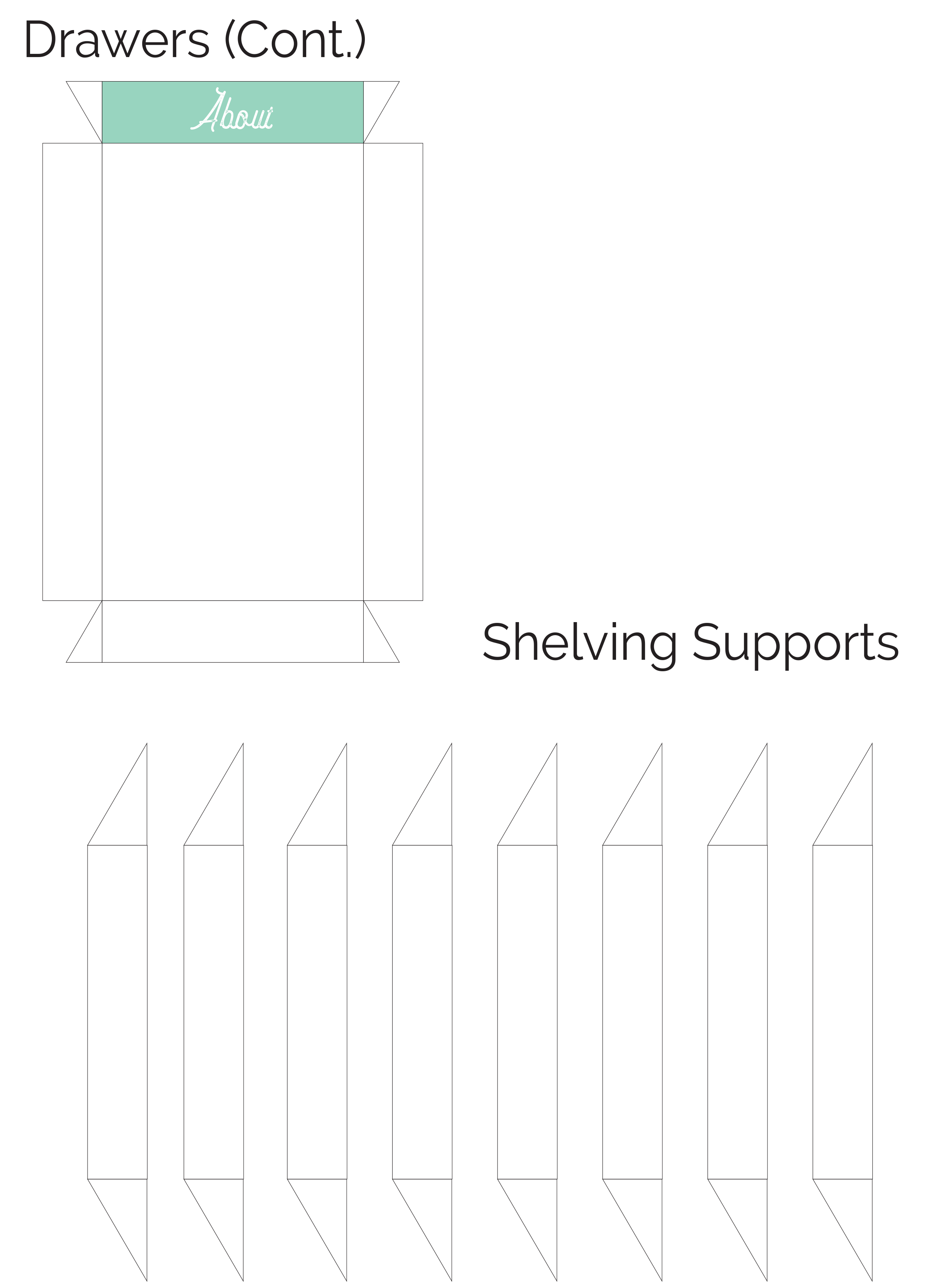
With the leave-behind piece, I wanted to create an item that would leave an impact and would be useful, so it would be difficult to dispose of. With this in mind, I created a small set of drawers that would hold cards that would be a miniature version of my portfolio. This would make adding to the portfolio at a later date very easy. These cards would be the same size as a business card, so I would be able to include a business card as well. The drawers would be l labeled with programs I am experienced in. The card would be placed inside the drawer that was used to create the design. There is also an “About” drawer to contain the identifying information such as the business card. The shelving unit itself is designed using the elements of the brand that I had established. I used the design for the front of the business card as the top of the shelving unit. Each side contained the paperclip element that is present in the logo. The bottom of the shelving unit contains my contact information in case the business card was lost. The front of each drawer would be the pastel mint-blue that matches the logo and the font utilized is the same as the previous print materials.