Responsive Design Portfolio
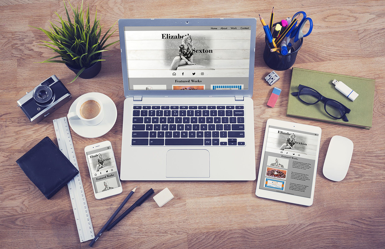
This portfolio was my introduction into responsive design, and it created the basis that this website was grown on. The goal of this project was to create a responsive webpage that would showcase my work as a graphic designer.
Sitemap
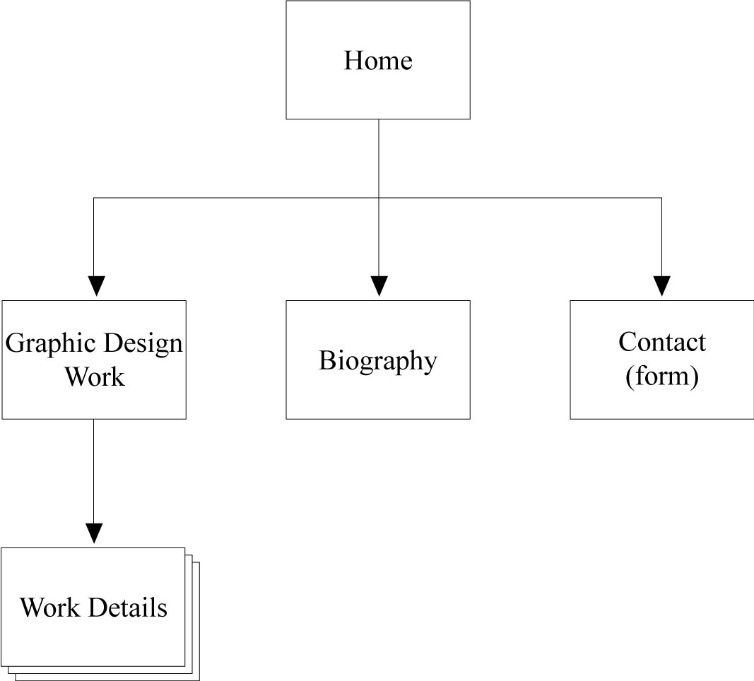
The sitemap is incredibly useful to gather the required pages of the site and determine the structure of the overall website. I decided to revise the “Graphic Design Work” section in the final design to streamline the process. For ease of navigation, I decided to include the details of all designs right upon the portfolio page. Some of the more indepth projects link to a seperate page to include all elements in one location.
Desktop Wireframe
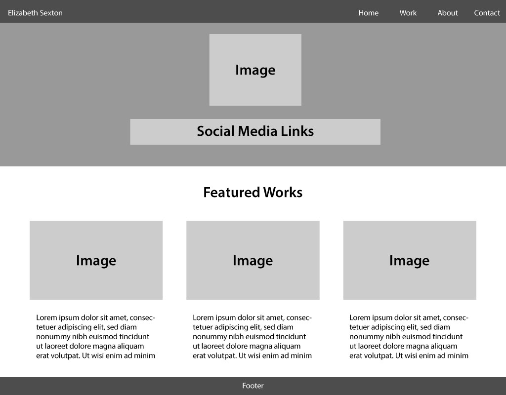
The desktop wireframe was structured to best take advantage of the large screen space typically afforded to desktop computers. Compared to the other wireframes, this allowed for the greatest display of information at once.
Tablet Wireframe
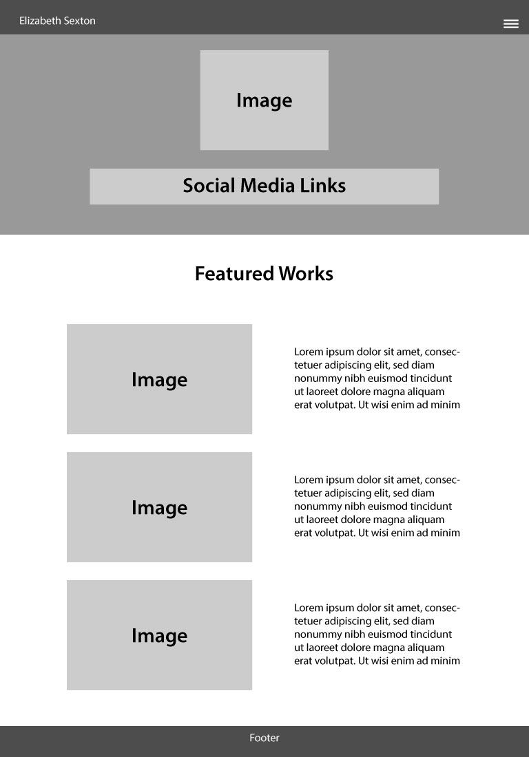
The tablet viewport permits a unique combination of the advantages and limitations present in the other two wireframes. With a larger screen, it permits more information to presented at once than can be displayed upon the mobile view. But it still requires condensing of the presented information, similar to the mobile view.
The wireframe for the tablet view ultimately had to be adjusted due to the ability to move the text to the left of the pictures was not permittable through bootstrap’s grid structure. Instead, I decided to make the text fall beneath the images to still provide the same experience, in a slightly different layout.
Mobile Wireframe
The mobile wire frame was the most challenging. Due to the screen’s small size, the information had to be presented in a way that was easily accessible and legible. I did this through streamlining the site and condensing the navigation.
Desktop Digital Mock-Up
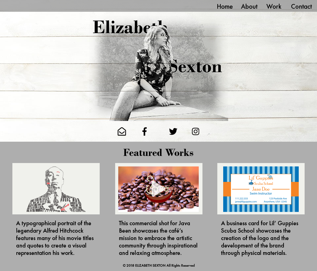
The desktop mock-up is a great way to determine the overall look and feel for the website. It allowed me to select the actual design elements that I was going to include and see how the final product would look once put together.
Tablet Digital Mock-Up
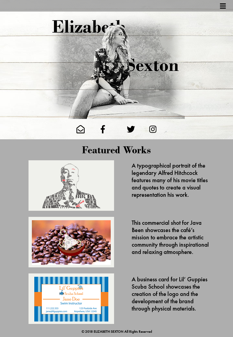
The tablet mock-up demonstrated the integration between the design elements that I created for the desktop mock-up and the wireframe created a tablet.
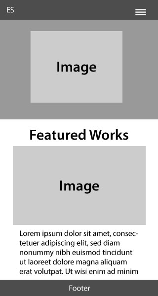
Mobile Digital Mock-Up

The mobile mock-up demonstrates how the finished design would appear upon a mobile screen. It illustrates how the site had to be streamlined to include greater scrolling to include all of the information in an easy to view manner.